
From their ugly duckling beginnings, tablets have slowly evolved into cool, sleek, and sophisticated slates, but the most impactful transformations have been subtle.
From the Apple iPad Air, which pushed the design envelope towards thinner and lighter, to the RIM Blackberry Playbook — plagued with poorly designed buttons — aesthetic plays a large role in the success of tablets.
New models continue to reach a design apex. Streamlined, simplified, and skinny construction are now the high-end standard, but it wasn’t always this way. Join us as we outline some of the subtle, but important, design changes in the short history of the contemporary slate.

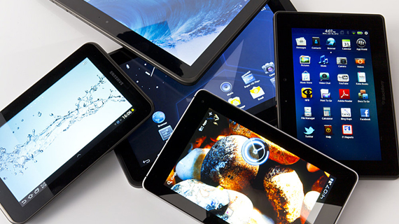
Manufacturers have flirted with a variety of tablet sizes in hopes of finding the perfect one. At first, 10 inches dominated the scene, then the 7-inch models started to flood the category with affordable and compact options. Now, manufacturers are jumping onto the 8- to 9-inch bandwagon. These mid-size tablets hit a size sweet-spot that meets the portable appeal of a 7-incher, with a larger screen.
Yet extra-large tablets still exist. Toshiba unceremoniously discontinued its 13-inch honker, but it didn’t stop Samsung from offering a super-sized slate of its own. The 12.2-inch Galaxy Note Pro might not be a perfect workstation replacement, but if any company embodies Goldilock’s resilience to finding the perfect size, it’s definitely Samsung and its full body of Galaxy Tabs.
A variety of sizes is a smart option for manufacturers, since everyone has unique needs (and hands.) The safest route for most has been to at least offer one small and one large tablet, but with the popularity of the 8- to 9-inch form factor, a medium option is the next big thing.
- Chamisa under fire over US$120K donation
- Mavhunga puts DeMbare into Chibuku quarterfinals
- Pension funds bet on Cabora Bassa oilfields
- Councils defy govt fire tender directive
Keep Reading

The original Apple iPad burst onto the scene like the Kool-Aid man and put every other bulky tablet to shame. Portability increased, but the turn towards a sleeker slate effectively ditched the functionality of ports for a fashionably thin look (thanks a lot, Apple.)
Remember that early tablets packed plenty of ports, like HDMI and full USB, but now you’re lucky if your slate has a solitary Micro-USB port and an expandable storage option. Ports not only add to the girth of the tablet, but they also add to the manufacturing cost. Producing a slimmer slate that’s light on the port options isn’t just “cool” for the consumer, it’s cost-efficient for the maker.
Ports on a tablet may be passe, but those with high-productivity needs depend on the functionality. With respect to the Microsoft Surface Pro 3, the perfect port-packing tablet-as-workstation still doesn’t exist. If debating between a tablet and laptop, the lack of ports versus portability is an important sacrifice. Why not both?

The last thing you want while kicking back with your tablet and enjoying a few episodes (or seasons) of Breaking Bad is a pair of pointy corners sharp enough to apply to an ivy league school digging into your palms.
For example, the Kobo Arc 10 HD tablet is one of the best Android/e-reader hybrids, successfully marrying Kobo’s Reading Life software with full access to the Google Play app store. However, the execution of the device falls short, with corners sharper than a witch’s hat that dig uncomfortably in your hands, due to the tablet’s heavier-than-average weight.
Depending on how you use your tablet, it’s either in your hands, on your lap, or on a flat surface. If it’s primarily in your hands, the device’s corners can be a design dealbreaker. Rounded edges, as well as a rounded back, are common features, but depending on what kind of silhouette manufacturers are going for, sharp corners sometimes still (unfortunately) make the cut.

Tablet’s backsides have ranged in texture, finish, and material from the beginning. There is a myriad of combinations: plastic, textured, smooth, and grippy like a stress ball; aluminum, smooth, matte, and slippery as a wet seal, but tactile comfort is a subdued yet critical ingredient to tablet design that is still being negotiated.
Slates like the aluminum-backed Acer Iconia A1-830 and Apple iPads, provide a comfortable and smooth finish that feels like the finger-equivalent of a fresh, cold pillow on your face, but they fail to provide significant grip support, like the plastic faux-leather backs on recent Samsung Galaxy Tabs or the industrial-chic Kindle Fire HDX series.
As a handheld device, tactile comfort is integral to an enjoyable experience. Ideally, the perfect tablet back is comfortable with functional grip support — and good looks to-boot. The attention to detail in designing a tablet’s back is an undervalued quality, but nonetheless a very important one

While phones allow you to display your personality through a variety of color options, tablets have primarily played it safe in that department. Most slates are grey, black, or white, with the rare exception.
Alcatel offers a pair with switchable back covers, Nokia ushered in a pop of color — too soon? — with its Lumia 2520, and a few kid-friendly budget options, like the Acer Iconia One 7, come in a few different shades, but overall, it’s a dull scene.
Unless your slate is guaranteed to fly off the shelves, a multi-colored line-up is a risky choice. Most colorful options are budget tablets and, though they give the consumer a sense of personalization, it’s choosing fashion over function. If you want a premium slate in something brighter than the current monochromatic options, we’ll have to wait and see if this trend will expand to higher-end tablets, but I doubt it.

As tablets get skinnier, so do their bezels. The perfect balance between thumb-space and maximizing screen-space is still being figured out.
Bezels provide a resting space for your thumbs, however, if you’re not big-handed, a thick frame unfashionably adds to the overall size of the tablet. Slimmer bezels also give the tablet a sleek, high-end look.
There are rumors of a bezel-less iPhone 6, but we’ve yet to see or even come close to a bezel-less slate. I wouldn’t put it past any of the top dogs to offer one eventually — especially if a new iPhone goes that route, since iPads often mirror iPhone designs. Less bezel means more screen space, so count me in for the downsizing, but the black frame still serves a functional purpose, making bezel-less a bad design choice for tablets.

Despite the progress in touchscreen technology, tablets still need a few buttons for optimal functionality. RIM and Amazon learned this lesson the hard way. Amazon completely omitted a volume rocker on the original Kindle Fire (and its successor), while the tiny, hard-to-press, recessed buttons on the RIM Blackberry Playbook made no buttons seem like an attractive option.
You’d be hard-pressed (pun intended) to find a tablet today with such detrimental design oversight, but — surprisingly — it still happens. Most Android tablet manufacturers opt for the typical on-screen navigation bar, but instead of sacrificing a small sliver of screen space, Samsung insists on packing every Galaxy Tab with capacitive buttons. The design consistency is applauded, however, it simply doesn’t work well for every model.
Button-minimalism isn’t a bad thing, though — as long as you have a power button and volume rocker, most operating systems offer everything else you need. In fact, for the sake of easy functionality, it’s best for manufacturers to leave superfluous buttons on the cutting room floor — even if they look cool when they light-up, Samsung.
Finding the best blend
The design standard for tablets is now light, sleek, and thin. Not all new tablets meet the criteria, but most trend setting premium slates do.
As internal specs continue to change alongside design, they will play an important role in whether tablets will eventually replace laptops. Maybe soon we’ll see better GPUs and audio quality, in addition to the speedy processors and super-HD screens we have now.
As I often tell people who ask me what the “best tablet” is, it depends on your individual wants and needs. Ultimately, the perfect tablet is subjective, and the best design is what works well for you.